


CASE STUDY
From Canopy Partners to Mosaic Clinical Technologies
Designing the foundation for a new healthcare technology brand
Role: UX Designer
Team: Digital Experience
Timeline: 2022–2024
Scope: Research, IA, wireframes, usability testing, UX consultation
How UX strategy shaped the evolution of Canopy Partners into Mosaic OS
product + brand + platform evolution over time.
What began as a website redesign for Canopy Partners became the UX foundation for an entirely new healthcare AI brand: Mosaic OS.
The original goal was straightforward — modernize the Canopy Partners website and improve clarity. But as research unfolded, it became clear the challenge was much larger. The product vision was expanding. The brand was evolving. The existing digital structure couldn’t support what the organization was becoming.
This project ultimately shifted from redesigning a website to architecting a scalable digital foundation for Mosaic OS.
The Challenge
Canopy Partners operated in a highly technical space—AI-driven medical imaging. While the technology was powerful, the website struggled to clearly communicate the platform’s value, differentiate in a competitive market, and guide users toward meaningful action.
When my team began working with the platform, the site reflected an early startup stage: dense content, inconsistent navigation, and limited structure for explaining complex technology. As the product evolved, the digital experience needed a stronger foundation—one that could translate technical depth into clarity while scaling with the company’s growing vision.
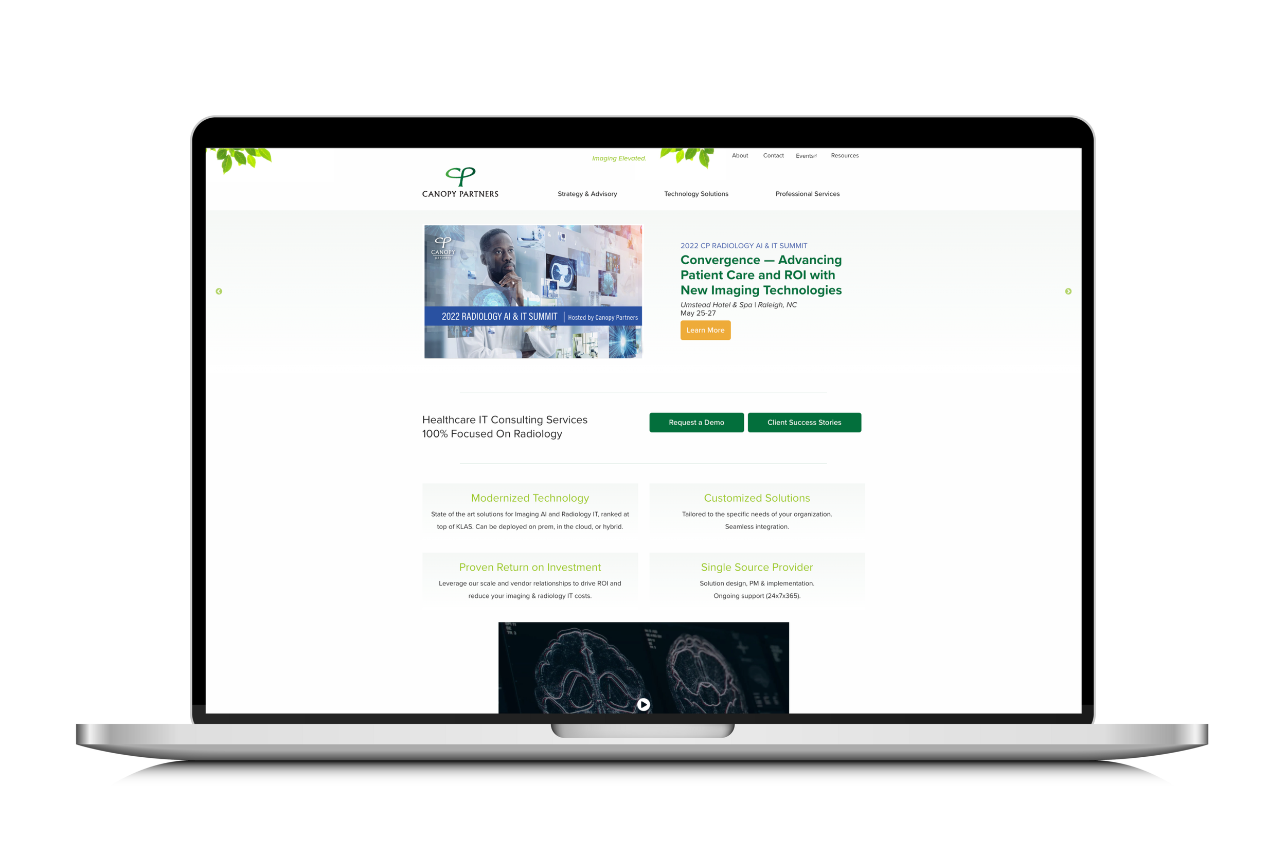
2022 — Original Canopy Website
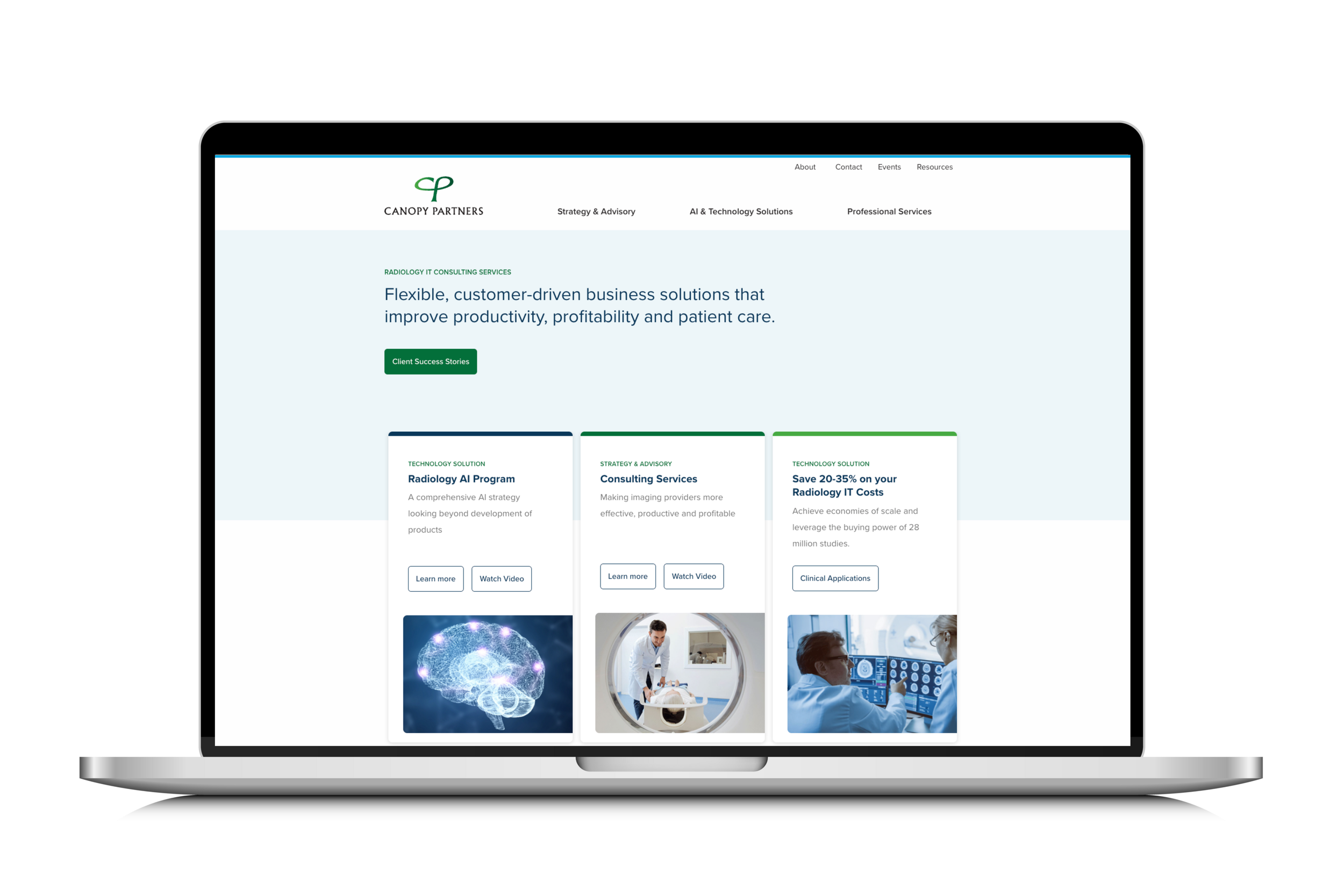
2024 — UX Redesign

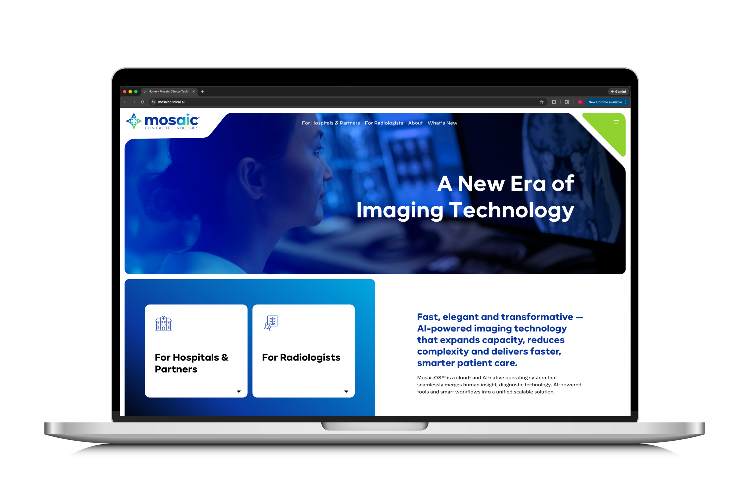
2026 — Mosaic Clinical Technologies
The product evolved from an early startup website into a structured platform experience, eventually becoming Mosaic Clinical Technologies, a radiology AI operating system.
My Role
I led UX research and experience strategy across the redesign of Canopy Partners and the early evolution of Mosaic OS.
As the UX designer on the project, I led research, architecture, and experience design efforts to transform the platform’s digital presence into something clearer, more structured, and aligned with user needs.
My responsibilities included:
UX research and competitive analysis
Information architecture and sitemap design
Persona and journey development
Wireframing and interface design
Usability testing and iteration
Accessibility (WCAG 2.1/2.2 Level AA) compliance
This work helped translate a technically complex product into a clearer digital experience for radiologists, healthcare organizations, and partners.
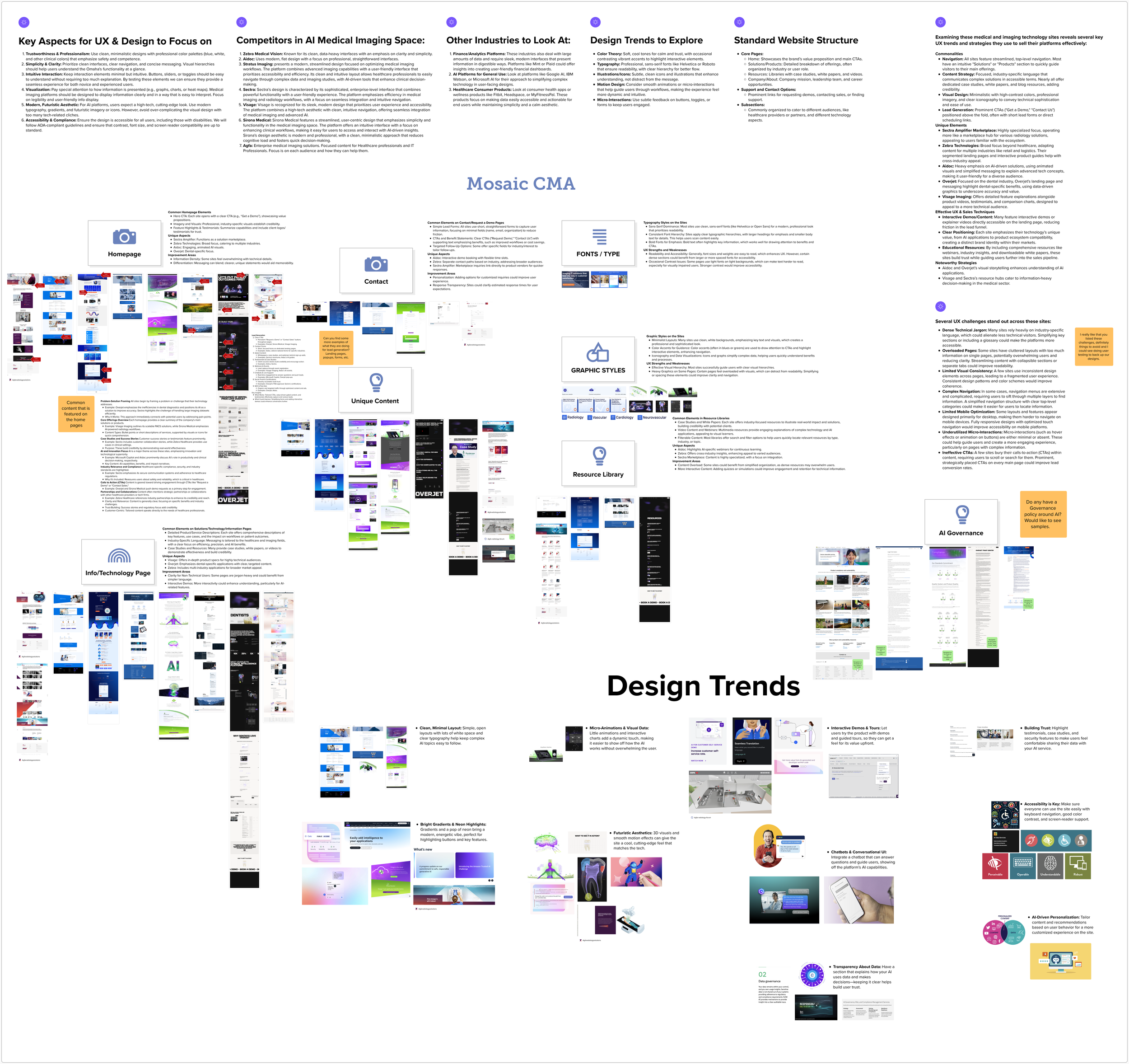
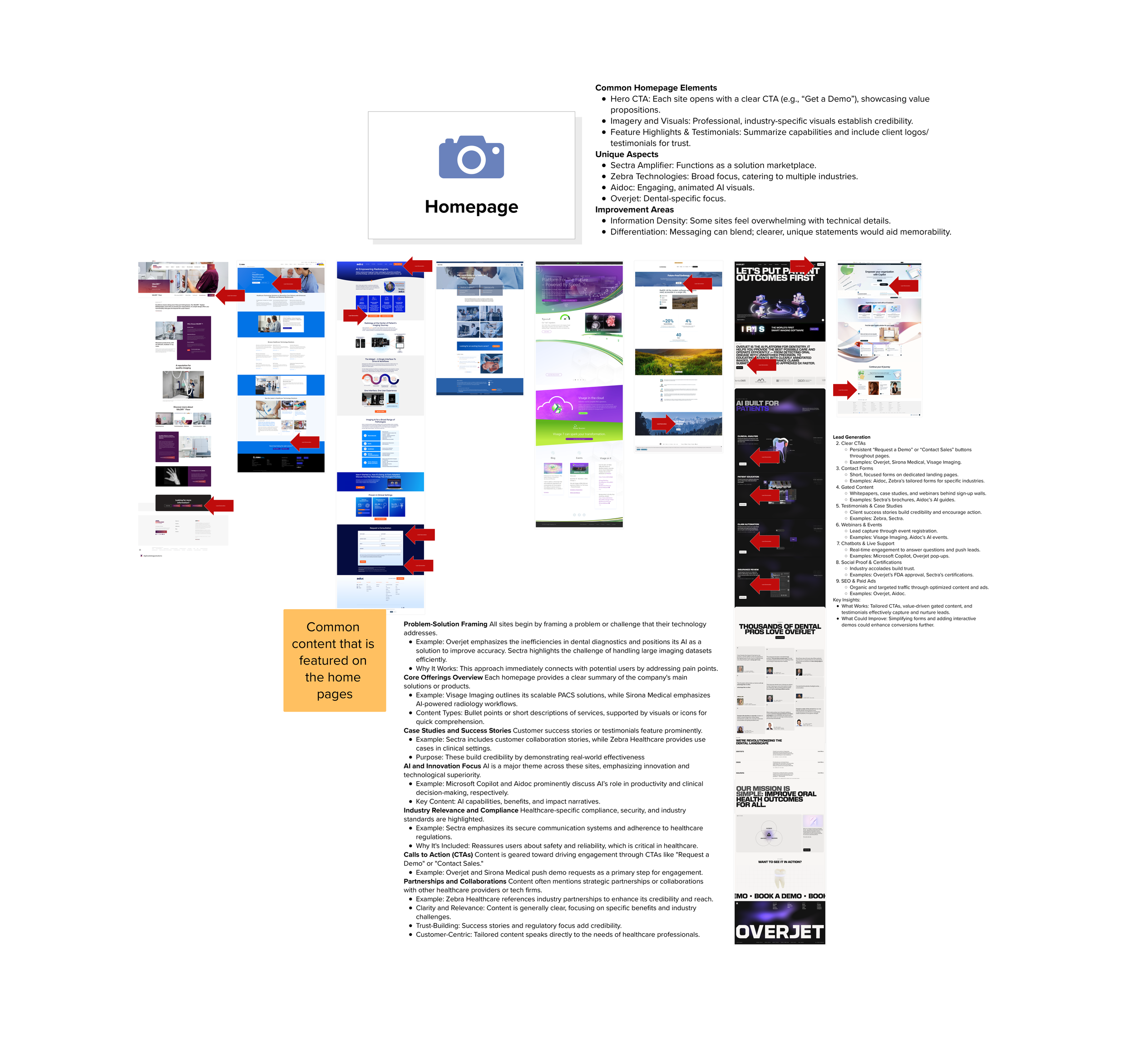
Phase 1: Research & Market Deep Dive
To guide the redesign, I conducted a deep competitive and industry analysis across AI imaging platforms, healthcare technology companies, and adjacent enterprise software products.
The research explored:
Competing AI medical imaging platforms
UX patterns across healthcare software
Enterprise SaaS design trends
Effective navigation and content architecture
Lead generation and product storytelling strategies

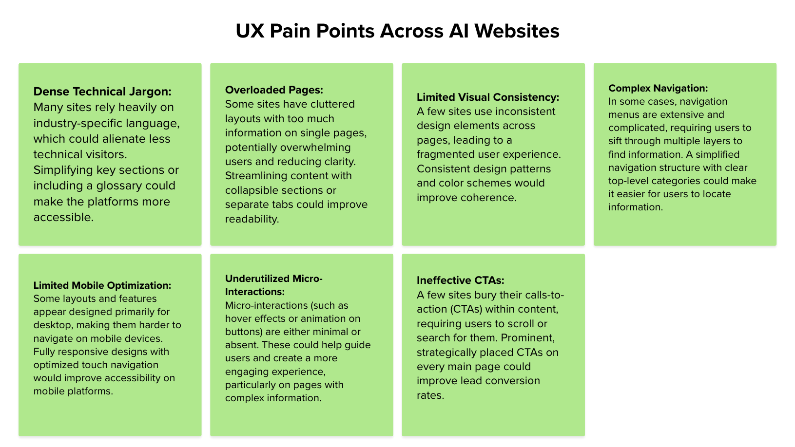
his analysis revealed common UX challenges across the industry:
Dense technical jargon
Overloaded pages
Complex navigation
Inconsistent visual systems
Weak CTA hierarchy
Limited mobile optimization
These insights informed the structure, hierarchy, and storytelling approach used in the redesigned platform.
Phase 2: Defining the Experience Strategy
Using research findings, I developed a UX framework centered on:
Modular, scalable information architecture
Clear value communication without oversimplification
Reduced cognitive load through structured content hierarchy
Accessible design principles from the start
Navigation systems built for growth
The goal wasn’t just a better site. It was a system that could evolve.

Proposed Site Architecture

One of the most impactful improvements was the restructuring of the site architecture.
The original site made it difficult for users to understand the platform’s capabilities and navigate between product, technology, and company information.
I redesigned the sitemap to create a clearer hierarchy that supported:
Product discovery
Technology explanation
Clinical value communication
Lead generation
Phase 3: Wireframes & Validation
Using insights from research and architecture planning, I developed wireframes that focused on:
Clear product storytelling
Strong visual hierarchy
Simplified navigation
Strategic calls-to-action
Improved content scanning
These wireframes became the foundation for the redesigned Canopy website.
Wireframes designed by the Digital Experience Team


Usability Testing & Iteration
I led usability testing to validate navigation clarity, understand user perception of the platform, and uncover friction points early.
The study included moderated prototype testing, open-ended feedback questions, and scaled perception ratings to assess usability, clarity, and confidence.
Initial results revealed click-ability confusion and the need to expand interactive zones for stronger affordance. After refining visual cues and interaction patterns, we saw measurable improvements:
Misclick rate decreased from 67.7% to 16.7%
Direct navigation success increased from 81.8% to 100%
These findings directly informed layout refinements, interaction hierarchy, and CTA visibility — strengthening the foundation that would later carry into Mosaic OS.


The Result: A Stronger Platform
The redesigned Canopy website introduced a clearer information hierarchy, stronger product storytelling, and a more cohesive visual experience.
The new platform improved:
Navigation clarity
Product communication
Lead generation pathways
Mobile usability
Brand credibility
Results
Streamlined User Experience: Our redesign significantly improved the platform's usability, resulting in smoother navigation and increased user satisfaction. Tasks that previously took multiple steps were now accomplished more efficiently, leading to a more positive user experience.
Consistency Across Platforms: By establishing design patterns and guidelines, we ensured a consistent user experience across all parts of the platform. This consistency not only improved usability but also strengthened the brand identity of Canopy Partners.
Scalability for Growth: The new design is scalable, allowing Canopy Partners to seamlessly integrate new features and adapt to changing industry trends. This flexibility ensures that the platform can grow alongside the company and continue to meet the needs of its users.


By redesigning the platform and transitioning the website to an in-house CMS, the team reduced reliance on external vendors and improved long-term maintainability. This shift provided greater control over updates, faster iteration cycles, and generated approximately $120K in annual cost savings, allowing resources to be redirected toward product and platform development.
From Canopy Partners to Mosaic Clinical Technologies
As the company evolved, the Canopy platform expanded into what is now Mosaic Clinical Technologies, a radiology AI operating system designed to integrate multiple imaging technologies and workflows.
While an external agency ultimately built the Mosaic website, my early UX research, architecture strategy, and platform foundations informed many of the design decisions that shaped the product’s digital direction.
I also provided UX consultation during the Mosaic website build, contributing feedback on:
Information architecture
Layout hierarchy
Accessibility considerations
Platform storytelling

The platform evolved from a startup website into a comprehensive AI radiology ecosystem.